Gallery Widget
Properties
Images
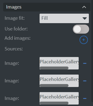
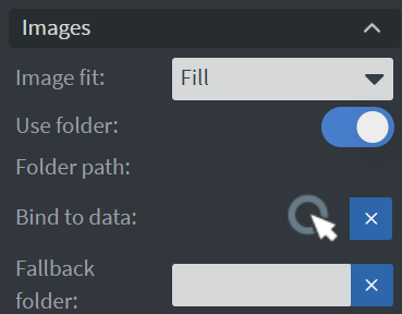
In the Images Menu, you can define the source:
- It can be a folder.
- Manually selected items.
- You can bind the widget to a datasource.
 |  |
|---|
- Image fit: Here you can select an image fit option. You can choose between Fill, Contain, or Cover.
Behaviour
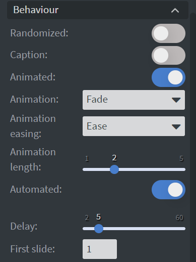
In the Behaviour Menu, you can customize the gallery settings:
Randomized
If enabled, the widget will shuffle the items in the playlist.
Caption
With this function, you can display the name of the items.
Animation
Here you can set how the widget should apply animations between changes.
Delay
Here you can set the duration until the next item is displayed.
First Slide
Here you can define which element comes first.
PDF Options
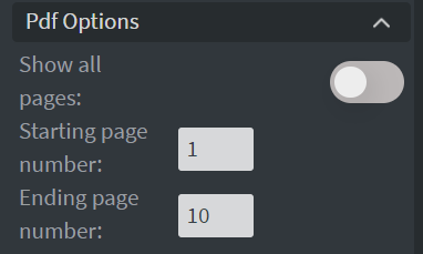
In the PDF Options section, you can configure how PDFs are displayed:
- Show all pages is enabled by default. If you disable it, you can define the starting and ending pages.
Size & Position
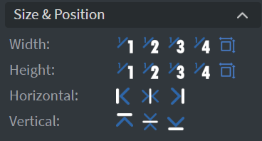
In the Size & Position Menu, you can select the width, height, and placement of your widget quickly.
Proof of Play
Learn more: Enable reporting (Content) and Enable reporting (Slide).
Effects
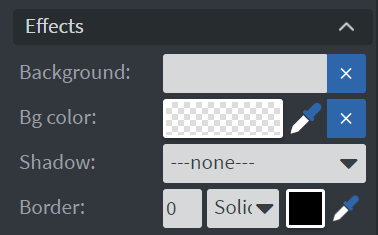
In the Effects Menu, you can:
- Select a Background image or Color for your widget.
- Enable the Click through function to interact with other widgets behind this one.
- Add a Shadow and Border to your widget.
Animation
In the Animation Menu, you can choose the Enter, Repeat, and Exit animations of your widget.
Bind to Data
You can bind a datasource to your widget in the Data field.
Interaction
In the Interaction field, you can create touch events.
Additional Properties
Under the Jump Menu, you can click on the three dots to access Additional Properties (aka MORE). However, this section is not detailed in the current documentation.