Media Widget
Properties
Source
In the Source Menu, you can:
Datasource
Use the Data Picker tool to select your Datasource.

If you want to pull in files from an external data source, then you should enter the full URL, or if you just want to enter file names, because the things to be accessed are in the file manager, then you should enter the file names together with the extension, like example.mp4
Folder
Use the Folder path to select the folder from where the widget pulls your data.
Loop
Use the Loop picker to select a Loop the widget plays.
You can double click on the widget to open the Loop for editing.
Preset
In the Preset Menu, you can choose between five presets: Default, Costume, Preset 1, Preset 2, Preset 3.

Feed
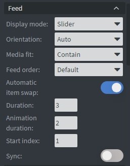
In the Feed Menu, you can:
- Choose Display mode.
- Set Orientation.
- Select Media fit.
- Set Feed order.
- Enable Automatic item swap.
- Set Duration.
- Set Animation duration.
- Set Start index.
- Turn on Sync.
Video Menu
In the Video Menu, you can:
- Turn on Hardware accelerated player.
- Change On video end behavior.
- Mute videos.

Slider Mode
In the Slider Mode, you can choose slide types: Up, Down, Left, Right, Instant, Fade, Hide.

Size & Position
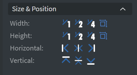
In the Size & Position Menu, you can select the width, height, and placement of your widget quickly. Learn more: Size & Position.
Style
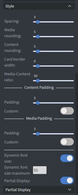
In the Style Menu, you can change:
- Spacing.
- Media rounding.
- Content rounding.
- Card border width.
- Media-Content ratio.
- Content Padding.
- Media Padding.
- Dynamic font size.
Partial Display
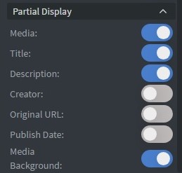
In Partial Display, you can turn on:
- Media.
- Title.
- Description.
- Creator.
- Original URL.
- Publish Date.
- Media Background.
Proof of Play
Learn more: Enable reporting (Content) and Enable reporting (Slide).
Effects
In the Effects Menu, you can add a Background image or Color to your widget.

Custom Colors
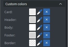
In the Custom Colors Menu, you can change the color of the:
- Card.
- Header.
- Body.
- Footer.
- Border.
Font
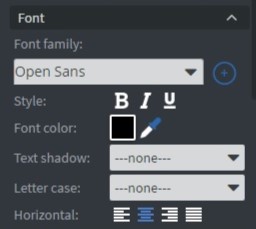
In the Font Menu, you can choose:
- Font family.
- Style.
- Font color.
- Text shadow.
- Letter case.
- Horizontal text layout.
Date Format
In the Date Format Menu, you can add the date to your widget.

Character Limits
In the Character Limits Menu, you can limit the Title and Description characters.

Animation
In the Animation Menu, you can choose the style of the Enter animation, Repeat animation, and the Exit animation.

Additional Properties
Under the Jump Menu, you can click on the three dots to access Additional Properties (aka MORE). However, this section is not detailed in the current documentation.