PDF Widget
The PDF Widget allows you to display and interact with PDF files in your content.
Properties
Documents
In the Documents Menu, you can manage the sources used in the widget:
- Use the Add button to manually select elements with PDF file types.

- Enable the USE FOLDER option to select an entire folder containing PDF files.

Sources chosen via databinding will also appear here, as shown below:

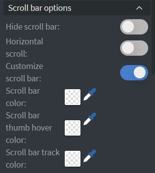
Scroll Bar Options
Customize the scrollbar of the PDF widget.
 |
|---|
- Center horizontally centres the pages when they fit inside the widget, instead of aligning them to the left. It is available when horizontal scrolling is enabled.
Behaviour
In the Behaviour Menu, you can manage the widget's behavior, including:
- Padding.
- Randomization.
- Scrolling.
- Page fit mode — how each page is sized to the space the widget gives it: Cover, Contain or Fill. Learn more: Fit settings.
- Add a password for protected PDF files.
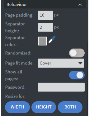
- Disable Show all pages to set specific start and end page numbers.

- Set the page separator's color between PDF files.

Zoom buttons
Introduced in version 2.1, enabling Show zoom buttons adds zoom in and zoom out controls to the PDF widget on the device, allowing viewers to manually zoom into the document. A 1x reset button also appears when the zoom level is changed, allowing viewers to quickly return to the default zoom level.
Zoom button size sets the diameter of those buttons in pixels. It ranges from 24 to 200, with a default of 44, and appears only while Show zoom buttons is enabled — useful when the widget plays on a large screen or a touch display.
Auto-scroll
Introduced in version 2.1, Auto-scroll automatically scrolls through the PDF content without user interaction. When enabled, the following settings are available:
| Setting | Description | Default |
|---|---|---|
| Speed | Controls the scrolling speed | 15 |
| Rewind time | Time (in seconds) before the PDF rewinds to the beginning after reaching the end. Set to 0 to rewind immediately | 0 |
| Stop time at end | Time (in seconds) the PDF pauses at the end before rewinding | 3 |
| Pause on hover | When enabled, scrolling pauses when the user touches or hovers over the widget | Enabled |
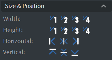
Size & Position
In the Size & Position Menu, you can select the width, height, and placement of your widget quickly.
Proof of Play
Learn more: Enable reporting (Content) and Enable reporting (Slide).
Effects
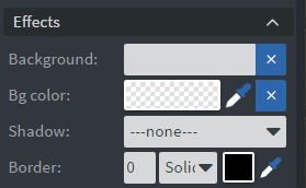
In the Effects Menu, you can:
- Select a Background image or Color for your widget.
- Add a Shadow and Border to your widget.
Animation
In the Animation Menu, you can choose the Enter and Exit animations for your widget.

Data
You can use the Bind to data tool to select your Datasource.

Interaction
In the Interactions Menu, you can add End actions for your widget.

Search actions
Introduced in version 2.1, the PDF widget exposes Search next and Search previous actions that step through the search matches within the document. Trigger them like any other widget action — from a button's touch action or an event — with an Interact Widget action that targets this PDF widget. See Action Triggers for the ways an action can be initiated.
Additional Properties
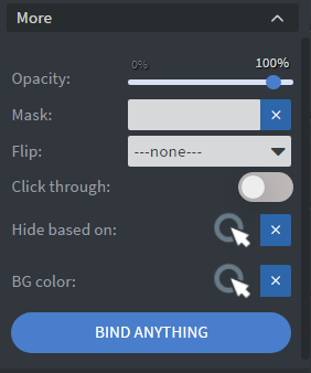
Under the Interactions Menu, you can click on the three dots to access Additional Properties (aka MORE).
Opacity
Adjusts the transparency and rounds the edges of your widget.
Mask
Lets you select a PNG image to affect the shape of your widget.
Flip
Allows flipping your widget horizontally, vertically, or both.
Click Through
Enables clicking through the widget to interact with other widgets behind it.
Hide Based On
Hides the widget based on data from a Datasource. If the datarow of the device and the given data are not the same, the widget will not appear on the device.
Background Color (BG Color)
Sets a background color for the widget from a Datasource.