Pie Chart Widget
This section is only visible if you have any kind of datasource already set up, as they can't work without connected data.
Properties
Data
You can use the Bind to data tool to select your Datasource.

Size & Position
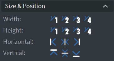
In the Size & Position Menu, you can select the width, height, and placement of your widget quickly.
Proof of Play
Learn more: Enable reporting (Content) and Enable reporting (Slide).
Behaviour
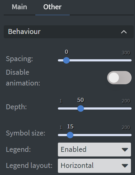
In the Behaviour Menu, you can customize the pie chart settings:
- Set the spacing, depth, and size of the symbols.
- Choose to display or not display your legend.
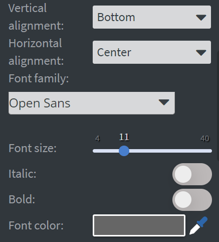
- Set the layout as well as the vertical and horizontal alignment of the legend.
- Set the font family, size, style, and color of the legend.
Colors
In the Colors Menu, you can set the color of the slices individually.

Effects
In the Effects Menu, you can add a background image or color to your widget.

Animation
In the Animation Menu, you can choose the Enter and Exit animations of your widget.

Additional Properties
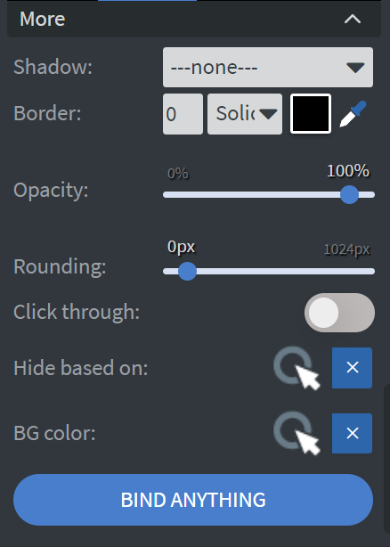
Under the Animation Menu, you can click on the three dots to access Additional Properties (aka MORE).
Shadow
Adds a shadow to your widget.
Border
Adds a border to your widget.
Rounding
Changes the transparency and rounds the edges of your widget.
Opacity
Adjusts the transparency of your widget.
Click Through
Enables clicking through the widget to interact with other widgets behind it.
Hide Based On
Hides the widget based on data from a Datasource. If the datarow of the device and the given data are not the same, the widget will not appear on the device.
Background Color (BG Color)
Sets a background color for the widget from a Datasource.