Custom Widget
With the Custom widget, you can display a website, custom HTML code, or even a Google Form. Using this widget requires a solid understanding of iFrame embedding and its limitations, as many options are restricted for security reasons. Before proceeding, check the Related articles for your specific use-case.
Related Articles
- How to Embed External Content
- How to Embed Password-Protected External Content
- How to display a website in a separate webview
- Alternative Embedding Methods
Properties
Data
In the Data Menu, you can bind data from datasources.

Text
In the Text Menu, you can choose your Content type:
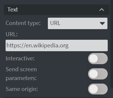
- URL type: Set the URL that you want to display. You can also make it Interactive and display it from a Same origin website.
- Supports Quick Edit functionality for changing the URL without opening the full content editor.
- With Use separate webview, supported players display the URL in a native webview instead of an iFrame. Learn more: How to display a website in a separate webview
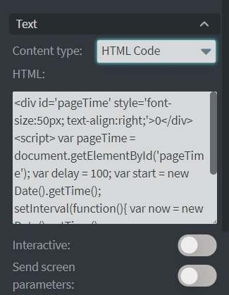
- HTML Code type: Display HTML code that you write or paste into the text box. You can also make it Interactive.
- Does not support Quick Edit functionality.
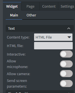
- HTML File type: Display an HTML file that has been uploaded to the File manager. The HTML file picker offers HTML files only, and an external address cannot be entered here — use the URL type for that.
Learn more: Quick Editable Widgets
If a scrollbar appears inside the widget, it comes from the embedded page itself: its content is larger than the area it has. The widget has no scrollbar setting, and Wallboard cannot hide it from outside, because the browser does not allow styling a page loaded from another address. Hide it in the page's own CSS instead. If the content fits anyway:
html, body { overflow: hidden; }
If the page still needs to scroll, but the bar should not show:
::-webkit-scrollbar { display: none; }
With the HTML Code and HTML File types, add the same CSS to your own code.
Size & Position
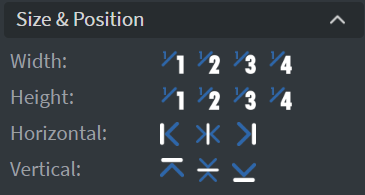
In the Size & Position Menu, you can select the width, height, and placement of your widget quickly.
Proof of Play
Learn more: Enable reporting (Content) and Enable reporting (Slide).
Effects
In the Effects Menu, you can select a background image or color for your widget.

Animation
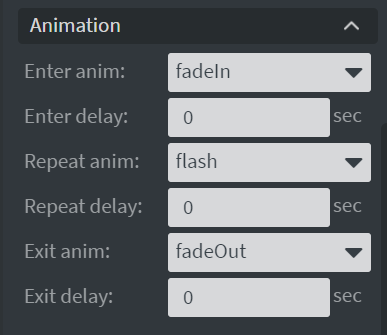
In the Animation Menu, you can choose the Enter, Repeat, and Exit animations of your widget.
Additional Properties
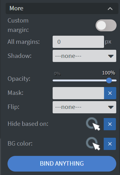
Under the Jump Menu, you can click on the three dots to access Additional Properties (aka MORE).
Custom Margin
Allows you to set a custom-sized margin to your widget.
Shadow
Adds a shadow to your widget.
Opacity
Changes the transparency and rounds the edges of your widget.
Mask
Lets you select a PNG image to affect the shape of your widget. Learn more: Masking.
Flip
Allows you to flip your widget horizontally, vertically, or both.
Click Through
Enables clicking through the widget to interact with other widgets behind it.
Hide Based On
Hides the widget based on data from a Datasource. If the datarow of the device and the given data are not the same, the widget will not appear on the device.
Background Color (BG Color)
Sets a background color for the widget from a Datasource.