Image Widget
The Image widget allows you to add pictures to your content.
Properties settings
Image
Source
Under the Image Menu you can set the source picture of your widget.
Bind to data
With Bind to data you can set your source with data sources.
Hide placeholder
Enable Hide placeholder to keep the widget invisible when no image is assigned, instead of showing the default placeholder image. Introduced in version 2.1.

Size & Position
Adjust dimensions
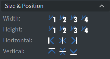
In the Size & Position Menu you can select the width, height, and placement of your widget quickly.
Proof of Play
Learn more: Enable reporting (Content) and Enable reporting (Slide).
Effects
Background customization
In the Effects Menu, you can select a Background image or Color for your widget.
Click through
Enabling the Click through function allows you to click through the widget and interact with other widgets behind this one.
Shadow & Border
Here you can add a Shadow and Border to your widget.
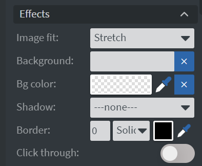
Image fit
Image fit decides how the image is sized to the space the widget gives it. Choose between Cover, Contain and Fill. What each one does, and the other settings like it: Fit settings.

Animation
Enter & Exit Animation
In the Animation Menu, you can choose the Enter and Exit animation of your widget.

Bind to data
Datasource Selection
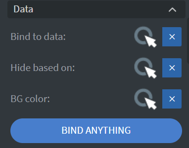
You can use the Bind to data tool to select your Datasource.
Hide based on
You can hide the widget based on data from a Datasource.
BG color
You can give a background color for the widget from a Datasource.
If the data row of the device and the given data are not the same, the widget will not appear on the device.
Filter
Image modification
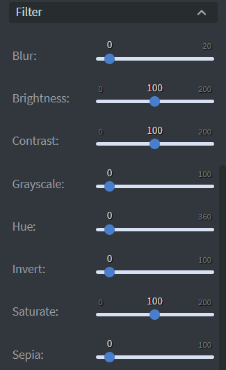
The Filter Menu allows modification of your image with different types of filters.