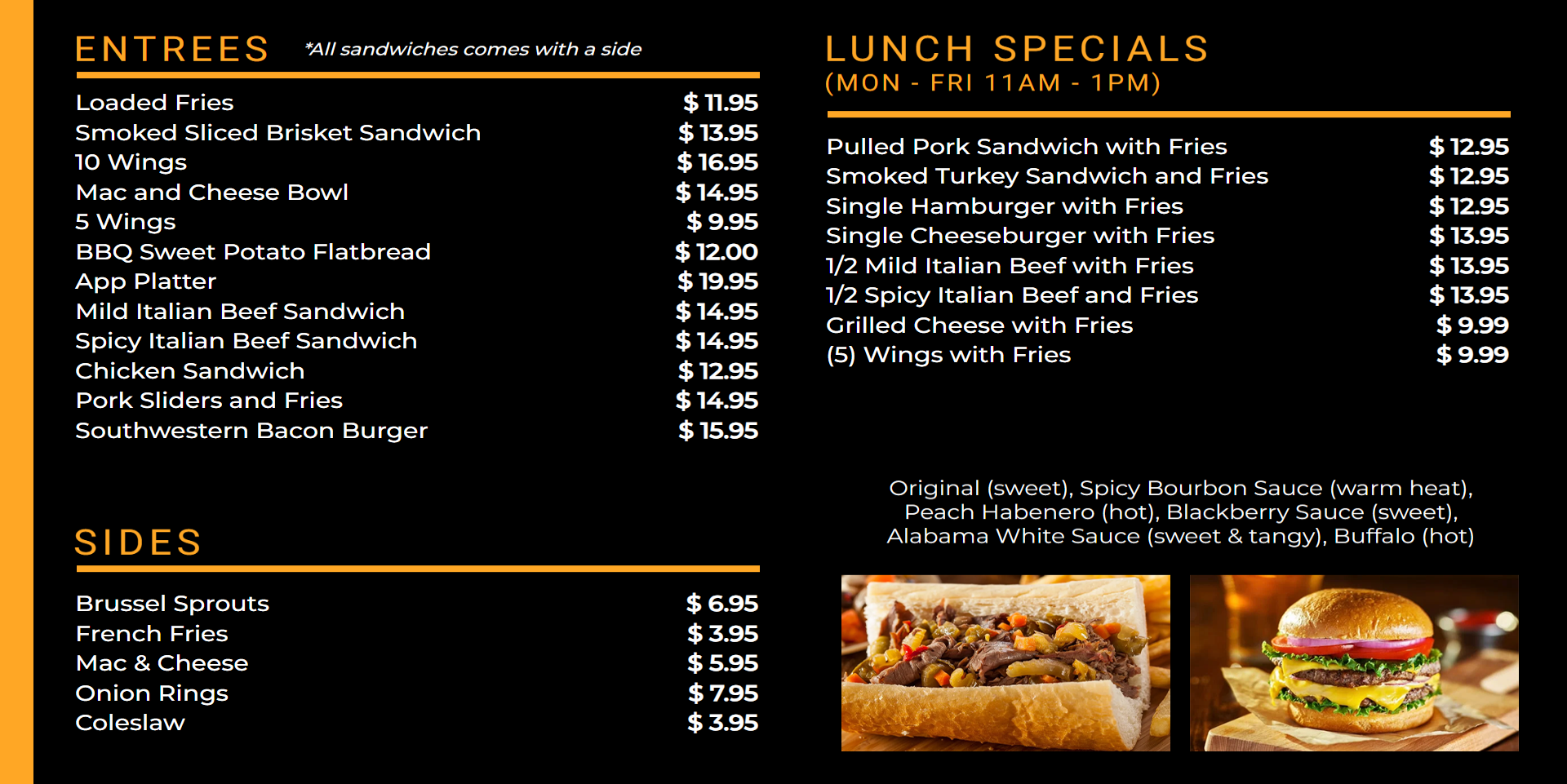
MenuBoard app
This article introduces you to our custom MenuBoard app and its core features.
To learn how to use the MenuBoard app with our Toast integration please refer to our use case article:
How to use Toast with MenuBoard app!
The MenuBoard app is deployed to customer servers per request. To learn more contact our support at sales@wallboard.info!

What is MenuBoard?
With the MenuBoard app you can easily update your menus and display them on your business's screens so your customers are always well informed. If you have a touchscreen solution you can even make it interactable using widget touch events. When used alongside our Checkout app you can create a complete self-service experience.
Prerequisites
To utilize the functions of the MenuBoard app you first need to create a datasource. This can either be done with an out-of-the-box solution like Toast restaurant management system or you can create your own datasource using Google Sheets, Microsoft Excel or any other methods that follow the given raw JSON structure:
{
    "items": [
    {
    YOUR ITEM PARAMETERS GO HERE
    }
  ]
}
Below is a sample menu that contains two items:
{
    "items": [
      {
        "name": "Curly Fries",
        "guid": "45353fcc-3a79-46ce-8d5d-324a0be998he",
        "description": "Homemade curly fries",
        "image": "URL_FOR_YOUR_IMAGE_HERE",
        "price": 11.95,
        "menuName": "SEASONAL_MENU",
        "menuGroupName": "Entrees",
        "status": "IN_STOCK",
        "quantity": 1
      },
      {
        "name": "Crispy Chicken Wings",
        "guid": "65fd7b39-b374-4d9a-9a4c-df7a6fb3rtz5",
        "description": "Homemade crispy chicken wings",
        "image": "URL_FOR_YOUR_IMAGE_HERE",
        "price": 16.95,
        "menuName": "SEASONAL_MENU",
        "menuGroupName": "Main course",
        "status": "IN_STOCK",
        "quantity": 1
      }
    ]
}
Depending on how many items you have in your menu, your raw data could be much longer. After creating your datasource click the eye icon in the same row so you can double check that it follows a similar structure as the JSON above.
Setting up the widget
Datasource bindings
After you've successfully created your datasource you can place the MenuBoard app widget and configure the datasource bindings.
-
My dataset: This is the datasource you created that contains all your menu items. Correct configuration using the above example should look like this:

-
Target dataset: This is usually bound to a mock datasource that tracks the items you add to your cart and is only needed if you want to make a touchscreen ordering system for your customers using the Checkout app.
To include/to exclude
In this section you can specify which menu items should be displayed in the widget. You can filter to:
- Menu names
- Menu group names
- Item names
- Item tags
There are also options to skip items without images or a given number of items and even set up a price limitation.
Generic settings
Here you can configure the basic look of your menu. You can choose how you want your menu items to be sorted, remove certain text patterns, set how many rows and columns you want to use and more.
Widget types:
- Table display
- Ordering selector
A simple table style menu that can't be interacted with. Its main use is only to display menu items to your customers.
An interactive menu that can receive or send data using actions and sensor events.
Touch events:
- Next page (nextButton): Switch to the next page after you've interacted with the widget and selected a menu group.
- Previous Page (previousButton): Switch to the previous page after you've interacted with the widget and selected a menu group.
- Home (homeButton): Go back to the main menu (menu group selection).
- Return first page (firstPageButton): Return to the first page of the currently selected menu group.
- Set filter for menu name (setFilterForMenuName): Filter the main menu results based on user input.
- Set filter for menu group name (setFilterForMenuGroupName): Filter the menu group results based on user input.
- Reset filters (resetButton): Return to the main menu and clear all filters.
Sensor events:
- currentPage: The current page number.
- totalPageSize: The number of pages in a menu group.
- name: The name of the current item.
- allData: All data about the current item.
- productAdded (boolean): Returns true if the add-to-cart button has been pressed.
- itemQuantity: The quantity of the current item added to cart.
- selectedRadioButtons/selectedCheckboxes: Returns only the modifiers that have been selected.
- isMorePrevPage (boolean): Returns on every page change whether there's a previous page.
- isMoreNextPage (boolean): Returns on every page change whether there's a next page.
Popout window & Popout window button settings
With the enable popup window option turned on, you can make a window appear once a customer clicks on a menu item. The add, increase/decrease quantity and select modifier buttons are only relevant if you use them with the ordering selector widget type. If you want to utilize the Checkout app too here's where you can present your customers with additional choices during the ordering process and the option to add an item to their cart (Ordering selector widget type only).
Settings related to style
-
Name settings: Change how the names of your menu items look.
-
Description settings: Change how the description of your menu items look.
-
Price settings: Set the currency of your prices and change how they look.
-
Image settings: Change how your menu item's image is displayed.
-
Out of stock settings: Set up how your menu items should look when they're out of stock.
-
Align settings: Change the cell sizes, spacings and alignment.
-
Other settings: Add an easy reading line between your menu item's name and price (Only for single line table styles).
-
Main menu settings (Only ordering selector widget type): Change your main menu's layout and looks.
Developer settings
To make content editing easier, you can turn on show cell borders in developer settings so helper lines for tables become visible.
This custom app is under active development and any information in this documentation could be inaccurate or outdated! If you have any questions please contact our support at support@wallboard.info