Value
This article introduces you to our custom Value app and its core features.
The Value app is deployed to customer servers per request. To learn more, contact our support at sales@wallboard.info!
This custom app is under active development, and any information in this documentation could be inaccurate or outdated! If you have any questions, please contact our support at support@wallboard.info

What is the Value?
The Value widget is an easy tool to present a numerical value. The appearance can either be a numerical value, a color changing from one to another, or a percentage of specified characters/icons. The widget can be styled, formatted, and (excluding the character appearance) animated to your liking.
Why should I use the Value widget?
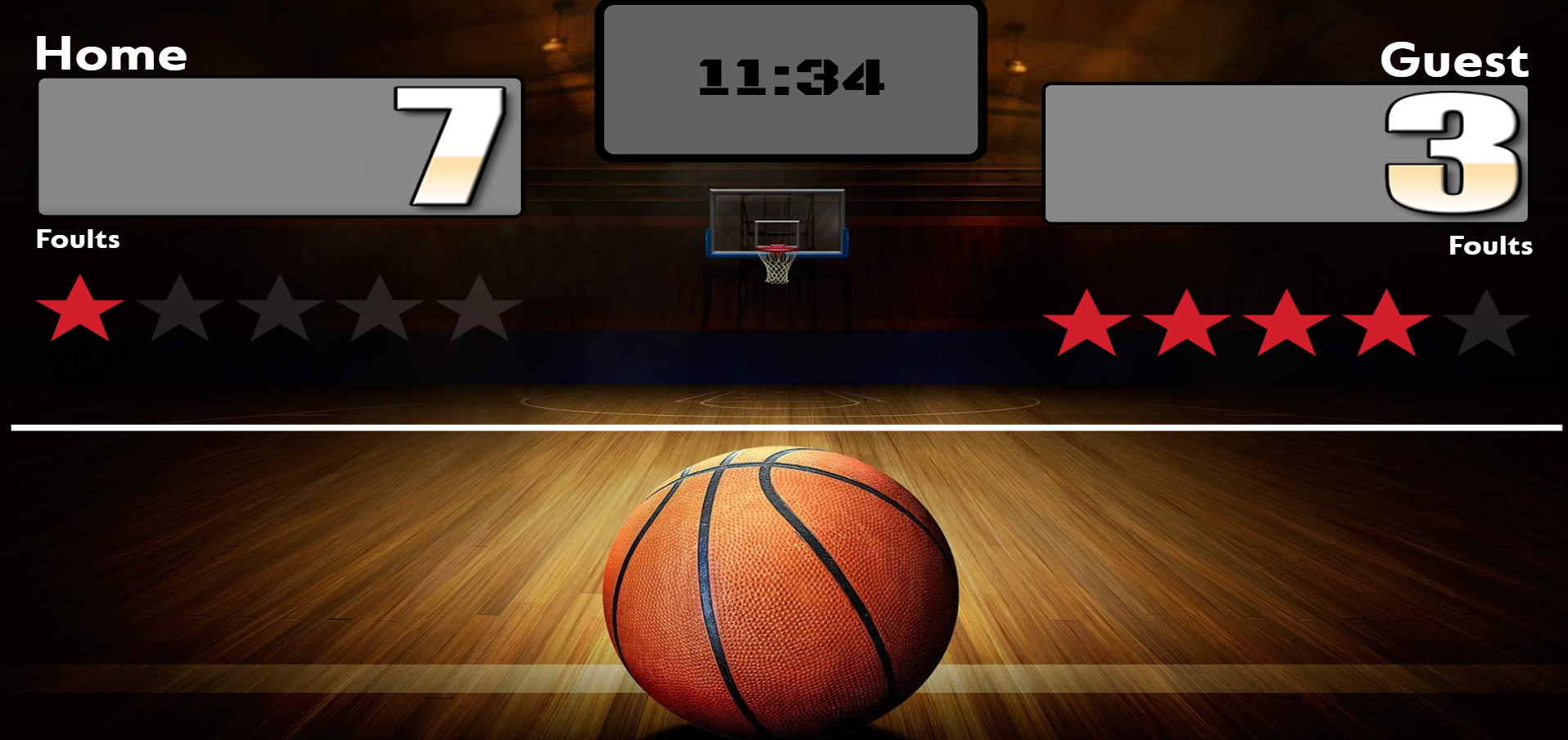
The biggest difference from a simple text field is that the Value widget has more complex functionality already implemented. The Value widget can be bound to a datasource and synced across multiple devices, making it perfect for creating, for example, a basketball scoreboard that can be reused.

Options
General Settings
Read Only Mode
Specifies whether the Value widget should only read from a datasource or not. If enabled, a datasource must be provided; otherwise, it will prompt you to do so. If disabled, the Value widget can function without a datasource and can both read and write data.
Minimum Value
Specifies the lower bound of the Value widget.
Note: If a datasource provides a different value, this setting is ignored.
Maximum Value
Specifies the upper bound of the Value widget.
Note: If a datasource provides a different value, this setting is ignored.
Default Value
Specifies the default value of the Value widget.
Note: If a datasource provides a different value, this setting is ignored.
Default Step
Specifies the default step value of the Value widget.
Note: If a datasource provides a different value, this setting is ignored.
Reset at Maximum�
Specifies whether the Value widget resets when reaching the maximum value.
Note: If a datasource provides a different value, this setting is ignored.
Appearance Settings
The Value widget has three different modes of appearance, each fully customizable:
- Number
- Color
- Characters
Number Appearance
Select Number Animation
Specifies the animation used:
- None: No animation.
- Simple: Dynamically changes the value over time until it reaches the current value.
- Scrolling: Special animation mode with font or image.
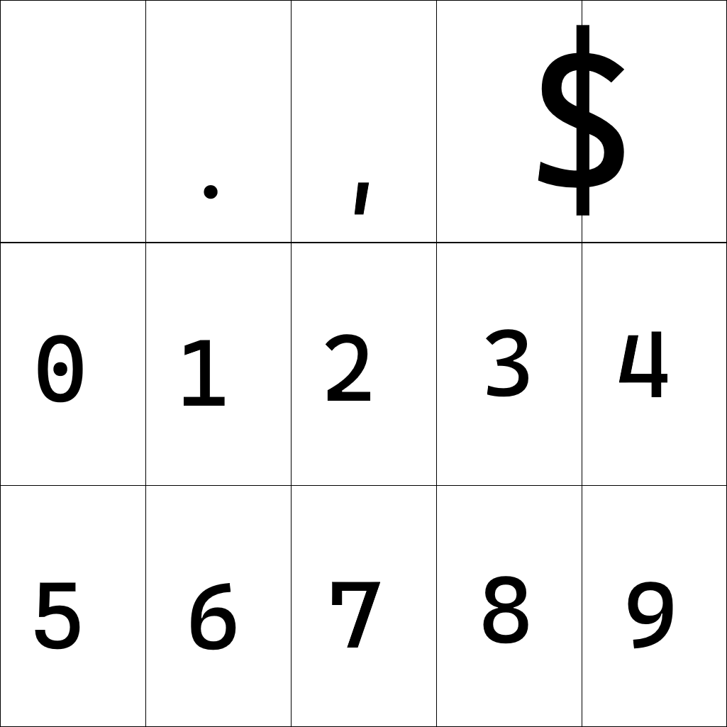
Select Scrolling Font Image
Specifies the image used as a font. If not provided, a simple font is used.
Expected layout: A 3x5 grid where special symbols take up two slots.

Truncate Leading Zeros
Specifies whether leading zeros should be removed.
Show Separators
Specifies whether number separators should be visible.
Show Decimals
Specifies whether decimal values should appear. The Value widget supports up to two decimal places.
Show Special Symbol
Specifies whether the special symbol should be displayed.
Select Special Icon
Allows picking a special icon. Not available if using a scrolling image font.
Animation Speed
Specifies the speed of the animation. Lower values indicate faster animations. 0 disables animations.
Color Appearance
The color mode does not show the current number but instead represents progress as a percentage from the lower to the upper bound.
Select Color Mode
Specifies how colors are displayed:
- Simple: A sharp transition between colors.
- Linear Gradient: A smooth transition between colors.
- Radial Gradient: Progress visualization starts from the center of the widget.
Lower Color Picker
Specifies the color representing progress.
Upper Color Picker
Specifies the color representing the remaining progress.
Show Percentage
Specifies whether to display the percentage value.
Degrees
Specifies the angle at which the lower color appears.
Animation Speed
Specifies the speed of the color transition. 0 disables easing effects.
Characters Appearance
This mode can function in two ways: Text Mode and Icon Mode.
Text Mode: A percentage of the given text appears relative to progress. Icons can be inserted using the format:
This is an example text. Here is a home icon: [icon:home]
And here is another icon: [icon:clear]
[icon:star] <- and here is another icon
Icon Mode: The type and number of icons can be selected. The displayed icons adjust based on progress.
Example: If 10 icons are set and progress is at 60%, then 6 icons will be shown.
Datasource Settings
Allows binding the widget to a datasource.
Setting Own Value
The Value widget updates its own value each time it changes.
Datasource
The Value widget updates the value key in the datasource object upon change. However, the config object updates only when an external message triggers it.
The Value widget only updates the datasource when Read Only Mode is disabled.
Example Datasource Object
{
  "Score": {
    "value": 100.39,
    "config": {
      "max": 1000,
      "min": 0,
      "defaultValue": 10.1,
      "defaultStep": 1.23
    }
  }
}
Sensor Events
The Value widget sends out these events:
- ReachedMinimum: Triggered when reaching the minimum value.
- ReachedMaximum: Triggered when reaching the maximum value.
- Increased: Triggered when value increases.
- Decreased: Triggered when value decreases.
External Messages
The Value widget listens to:
- Increase value: Increments by a specified amount or default step.
- Decrease value: Decrements by a specified amount or default step.
- Set value: Sets a new value within defined limits.
- Send config to datasource: Updates datasource with the current config.
- Set to random number: Sets a value randomly within allowed boundaries.
External messages only work when Read Only Mode is disabled.