Button
This article introduces you to our custom Button app and its core features.
The Button app is deployed to customer servers per request. To learn more contact our support at sales@wallboard.info!
This custom app is under active development and any information in this documentation could be inaccurate or outdated! If you have any questions please contact our support at support@wallboard.info
What is Button?
With the Button custom app you can easily create interactive buttons. You can fully tailor the button to your liking with various styling options, like icon selection, label animation or basic button styling.
Prerequisites
To utilize the function of the Button app you only need to give it a touch event on the other tab. With the touch event you can do loads of things, like move to other pages or interact with other widgets on the page.
Styling Options
After the Button is first placed on the editor it'll already have basic styling options.
Disable settings
- Disable Button text
- Disable Icon
- Disable Background
If you don't want text to appear on the button, then flipping this switch disables the button text.
If you'd like no icon to appear on the button, then by flipping this switch it disables the Button's icon.
If you'd like to use the background option in the other tab, you can disable the Button's background by flipping this switch.
Generic Settings
- Button Text
- Button Style
- Label Animation
- Button color
Defines the text that appears on the Button
On default if there's no button text defined, it defaults to "Button".
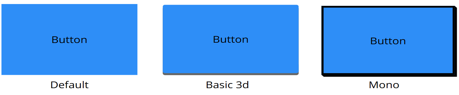
Determines the style of the Button that appears. Currently, there are 3 styles you can choose from:
Specifies the animation that the button uses. There a dozen you can currently choose from:
- None
- Bounce
- Flash
- Pulse
- RubberBand
- ShakeX
- ShakeY
- HeadShake
- Swing
- Tada
- Wobble
- Jello
- HeartBeat
Specifies the color of the Button.
Icon Settings
- Select Icon
- Icon weight
- Icon Location
- Icon size
- Icon distance
A dropdown menu that lets you choose an icon for the Button. The icons are from the Material font icons.
Lets you choose what the weight should have.
Lets you choose where the icon should appear relative to the Button text.
Specifies the Icons size in pixels
Specifies the icons distance from the Button text.
External Messages
The Button can be manipulated by external messages.
Set Button Text
When the Button receives this message it takes the parameters value and sets the Button text to it. If the parameter is empty the Buttons text value will default to an empty string.
Reset Button Text
When the Button receives this message it reverts the Button text value to the default set in the editor.