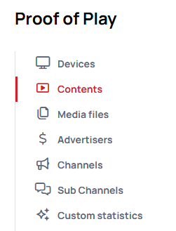
Proof of Play menu
Proof of Play is a statistics option to gain information about the below listed elements:
- Loops
- Contents that contains widgets and assets inside with Proof of Play
- Used files with Proof of Play
- Screens that played elements that contains assets with Proof of Play
To know more about Proof of play read the following article: How to enable Proof of play
Where can you collect statistics of Proof of Play?

Devices:
Click on device / Right click >> Details >> Proof of play tab
Playlists / Contents / Widgets:
Click on content / Right click >> Details >> Proof of play tab
Assets / Files:
Click on Files / Right click >> Details >> Proof of play tab
Analytics:
Proof of play tab under Analytics menu
How to use Proof of Play pivot table?
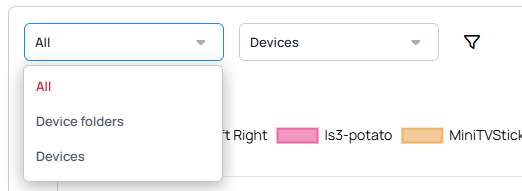
First of all, when you open the Proof of Play tab, you will see a Selector like this one:

- Here you can select the element whose proof of play report you want to see
- If you see options that are grey, that means there is no such element created under your customer.
- If you approach the proof of play modal from the details sections of the elements (devices, files or contents) the selector will show the information related to the item where you selected the proof of play tab.
After you selected the element you want to analyze, you can jump to the next part of the proof of play section.

- Every element has its own selector like this.
- Here you can specify the item you want to see in the chart.
- Also, you can use the filters to quickly find the specific thing you need.
- You can select only 1 folder/item
After you selected the item whose statistical data you want to see in the chart, you can jump to the time interval selector.
- Here you can select a time range from the presets, or define your own with the Custom interval selector.
After selecting the above-mentioned items, we can move on to "Group by," where you can choose the perspective for viewing the chart, such as how many times the content was clicked on a specific device or how many media files were included in the content.

- Each element has its own Group by section. If the selector is grey that means the time interval is too wide so it would be too much information to show in the chart, so this group by is not available, or you do not have this option in your setup.
- You cannot select multiple "Group by"s
- If you need, you can download the reports from each "group by"s as a CSV and analyze it.
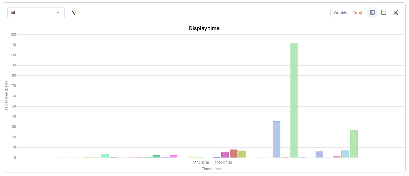
After everything is set, you can analyze the chart.

- With the "Hourly / Weekly / Total selector," you can specify the time intervals for slicing the chart within the previously defined time range.
- With the view selector button you can change how the chart should look like .
- In the right-corner you can even download the chart as PNG.
If you duplicate a content, the original content's proof of play data WILL NOT appear in the duplicated content due to different IDs.