How to make a Bird database
Presentation of the Content concept
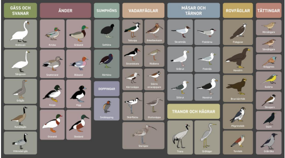
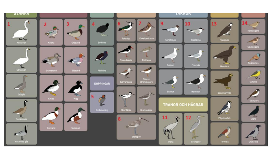
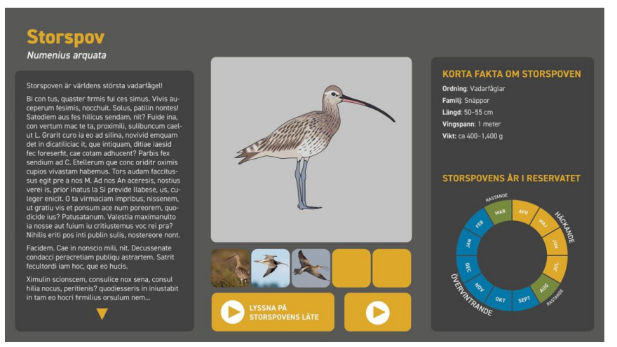
You wish to make a Content, where you can select/ click on a bird and when you click on it, it will jump to the bird’s page.
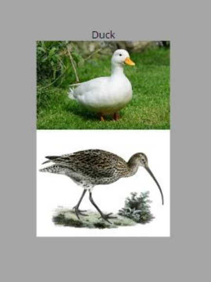
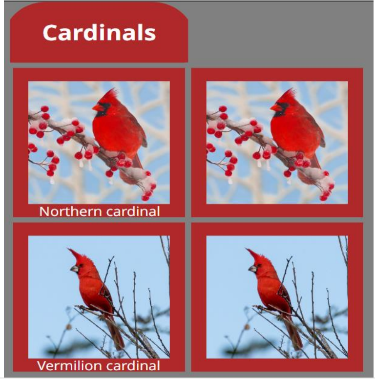
The Bird selector concept art:
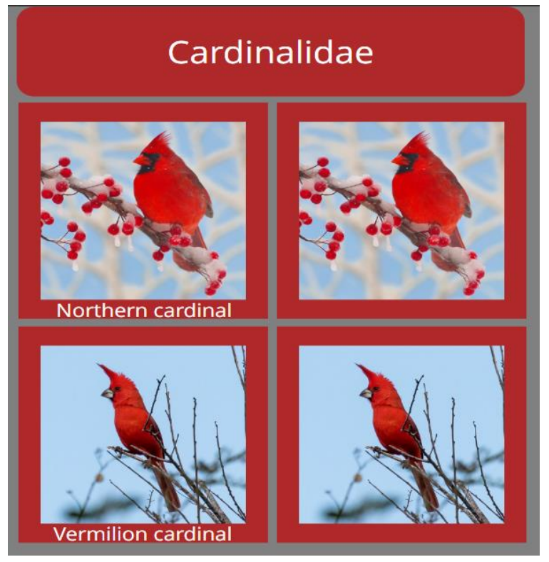
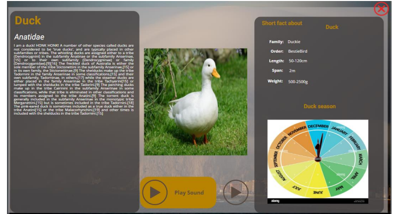
The Bird page concept art:
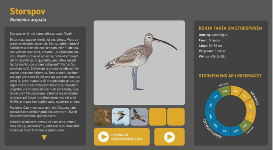
On the Bird’s page, there are two-play icons, where you can play the bird’s sound and an educational short video about it. Because you wish to display a lot of birds you do not want to separately make a single page for every one of them.
How can this be otherwise achievable? With this guide, you can easily make this complex content with only a few pages.
The presentation Content needs Touchscreen, or a Mouse/keyboard for the Touch actions, if you wish to use as is.
Data source
How to get started?
First, you need to think about and set up what your data source will contain. For this concept we need the bird’s:
- name
- latinName
- description
- order
- family
- length
- wingSpan
- weight
- chartImage
- video
- sound
This data source could be Internal or External. For External the best choice is to have it in JSON. In our presentation we will use the Internal data source type.
We use this structure as presentation only. Of course, you can structure your datasource anyway you like.
Files
- For your videos, please use the same resolution and size, because our widget cannot change the ratio, or when it does the video will not look good.
- For your sounds, please use the same playtime (short 1-2 sec), because you cannot stop our play audio, only replace it with a different sound (because the action can only be one time play).
Upload to your Account
Now we have our basic guideline, we need files for what we will use for our data source. In the Editor >> File Manager we create a new Folder for this project.
In this presentation this project called ‘Bird’.
In the Bird folder we create sub-folders for all of the birds
After that we firstly upload the shared resources (that every page uses: Play icon and the Close icon) into the root folder.
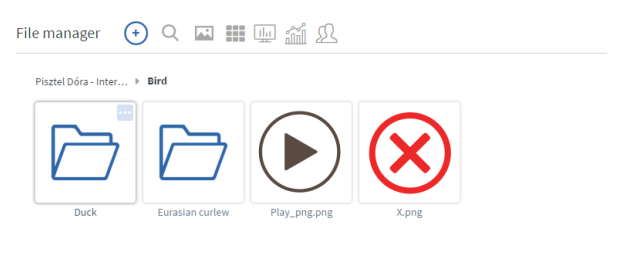
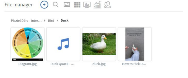
After this we upload the files separately in the created folders for each bird:
- Image
- Chart diagram
- sound
- video
Using Sharefolder
If you have all of the files inside the ‘Bird’ folder in another cloud sharing system, for example, Google Drive, or Microsoft OneDrive, you can connect those to your Account.
You need to navigate to the Settings >> Cloud Integration. Here you need to make a new Google or Microsoft credentials depends on where you have these files.
After you connect your account with the right credentials you need to go to the File Manager
With the + icon you can add a Share folder as + >> Connect Shared folder. Here you need to
select which cloud sharing service you wish to us
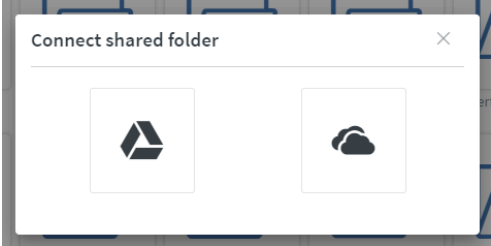
After you connect to the right share folder, it will automatically select the newly made Cloud integration name. After this we need to select the main folder source where all the bird picture are in and click on the Connect button.
This method needs time to sync all of the pictures and videos to download to your Account. Because of the sync, if anything is deleted from the main folder (Google or OneDrive), this will also be deleted from our server as well.
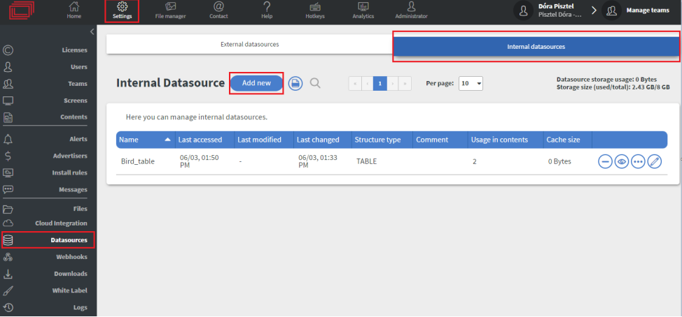
Creating the Datasource
Now that all files are uploaded in our Editor site, we need to create our Internal Datasource.
In the Settings > Datasources > Internal datasources > Add new button
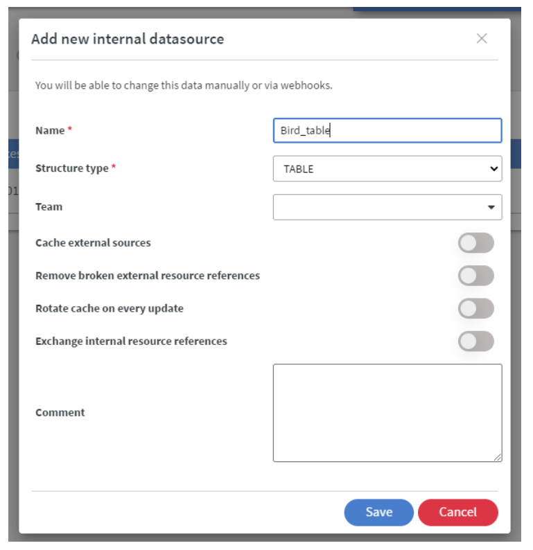
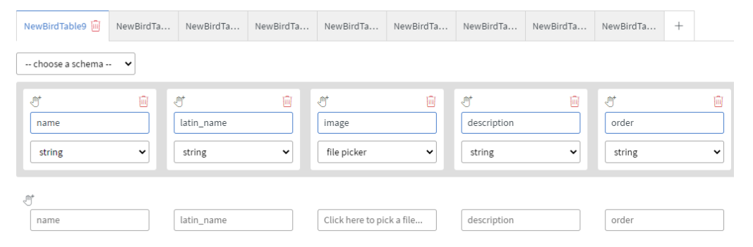
You need to name it and change the Structure type to TABLE. Let us call this new table as Bird_table.
After we created our new Table, you need to click on the Edit icon.
After this, our datasource table is opened and we can input our data.
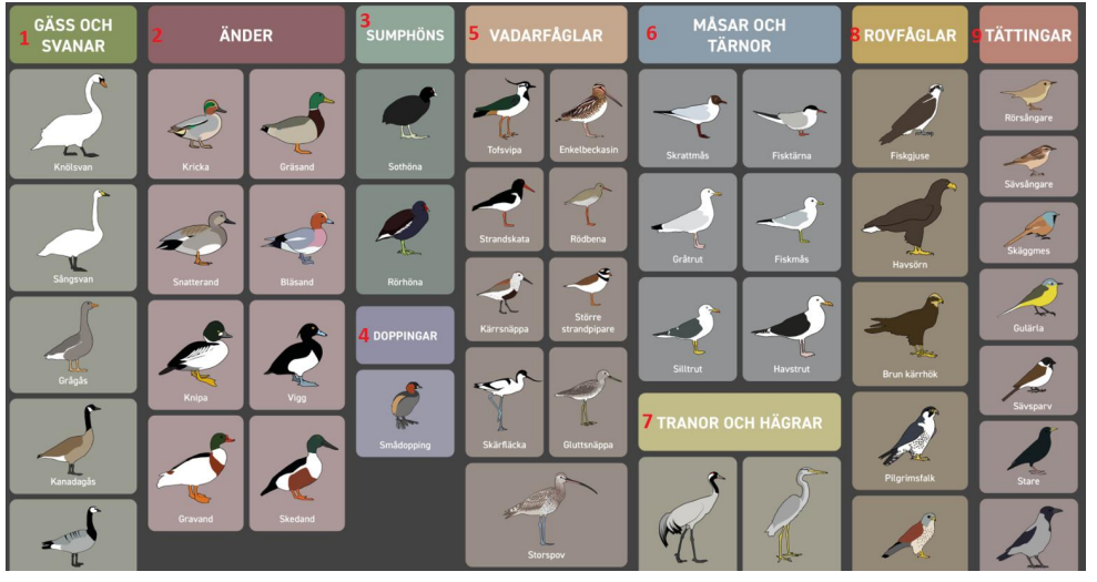
We create a new table for every bird type. This is necessary so we could easily separate our birds.
For this project we will make a total of 9 tables
Now let’s make our first table.
In the table with the **+**icon we can add a new row/header. For the rows you need to rename the
Keys and select their variable type as it is detailed below with KeyName - VariableType descriptions:

- name – String
- latinName – String
- image – file picker
- description – string
- order – string
- family – string
- length – string
- span – string
- weight – string
- diagram – file picker
- video – file picker
This is how your code need to look like (without any data):
{
 "Gass och svanar": {
 "header": {
 "name": "string",
 "latinName": "string",
 "image": "filePicker",
 "description": "string",
 "order": "string",
 "family": "string",
 "length": "string",
 "span": "string",
 "weight": "string",
 "diagram": "filePicker",
 "video": "filePicker"
 },
 "rows": [
 {
 "name": "",
 "latinName": "",
 "image": {
 "name": "",
 "id": "",
 "location": ""
 },
 "description": "",
 "order": "",
 "family": "",
 "length": "",
 "span": "",
 "weight": "",
 "diagram": {
 "name": "",
 "id": "",
 "location": ""
 },
 "video": {
 "name": "",
 "id": "",
 "location": ""
 }
 }
 ]
 }
}
You can add your table without remaking all the keys.
You need to click on the icon that you can find on the top right side.
This will change our table view to see our table in raw.
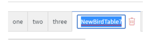
You need to add an enter after the ” { ”, and copy this code 8x times and rename the ”NewBirdTable” with the desired name (for example änder):
After this is done click on the Save&Close button. Select the edit button again. Now, we can see all of our separated tables with the same data structure.
You need to add a new name to them because otherwise, the new tables will not be made! If you mistype it or you wish to rename it you can rename by double-clicking at the Table name.
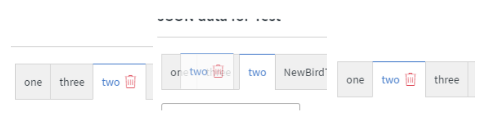
If you wish re-order the tables you can drag&drop them to the desired place.
Now that all of our Tables are completed, we just need to fill them with text and the filepickers with the pictures, videos of the birds.
We do not give the sounds to our datasource now, because we will connect it to the Bird inside of the Content.
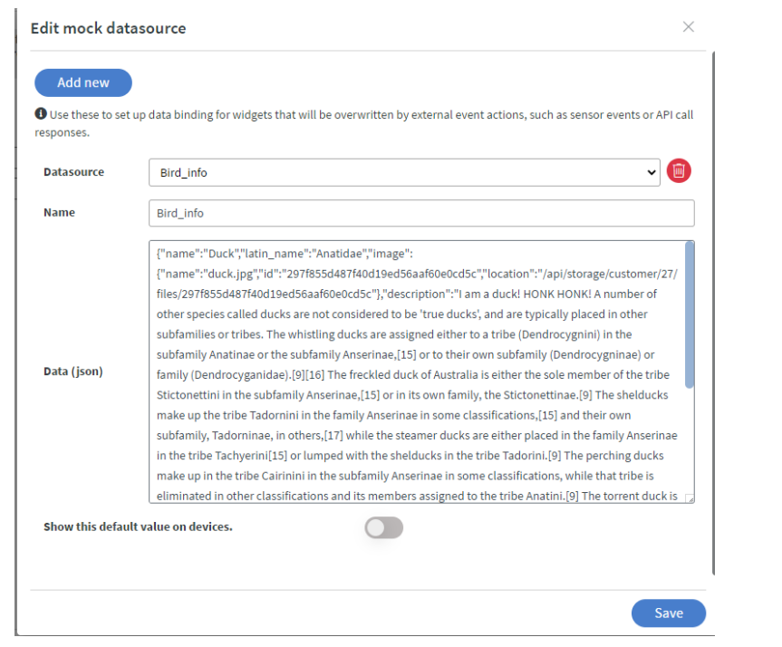
The last step is to copy one of the rows from the populated table (we will use this later as a mock datasource) like this:
{
"name":"Duck",
"latin_name":"Anatidae",
"image":
{"name":"duck.jpg",
"id":"297f855d487f40d19ed56aaf60e0cd5c","location":"/api/storage/customer/27/files/297f855d487f40d19ed56aaf60e0cd5c"},
"description":"I am the description",
"order":"BestieBird",
"family":"Duckie",
"length":"50-120",
"span":2,
"weight":"500-2500",
"diagramm":
{"name":"Diagram.jpg",
"id":"40ccf0b21939440bb68ee64b160f6ecd",
"location":"/api/storage/customer/27/files/40ccf0b21939440bb68ee64b160f6ecd"},
"video":{"name":"How to Pick Up a Duck #1 (full video).mp4",
"id":"096eeaf7bfd244cd801751d879aa4958","location":"/api/storage/customer/27/files/096eeaf7bfd244cd801751d879aa4958"}
}
The videos and pictures in the example data are bound to the example user.
To use your own files, please reattach them with the filepicker.
Also, if you delete one of the videos, or pictures or want to replace them you need to reattach them
to your Datasource table.
If you change your Datasource structure, you need to recopy the new structure, because otherwise there could be issues in the Content.
Content
Creating the Content
Now that the Datasource is finished and we have copied one of our bird’s statistics, we need to create the Content.
In the presentation, we simplified the content only as a showcase. These data are not valid, and you could style them differently.
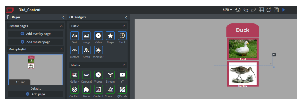
Pages
We need mainly 3 pages and another one that is optional:
- Default – Our Bird selector
The below pages should be created or moved to the ‘Other pages’ section, and should not be in the ‘Main playlist’ section.
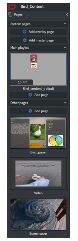
- Bird_panel – where the birds data will be displayed
- Video – where the Video will be display
- Screensaver (optional) - if no one is touching the screen it plays a slideshow or a different video e.g. the Museum logo with the tour of the bird section.
Default page
Databinding
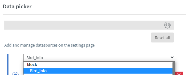
First, we need to bind our data. Navigate to the Content > Databinding > Base data path
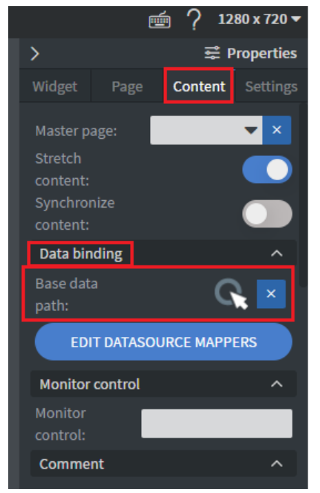
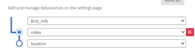
Here we need to use the Data picker and pick our Main table. In the presentation the main table, is the Internal Datasource table named the Bird_table.
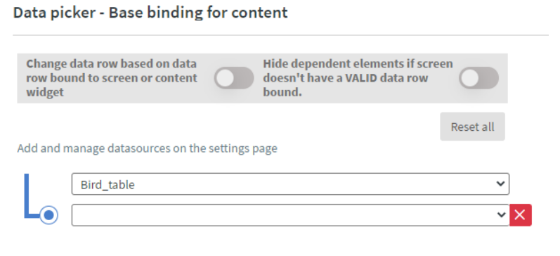
In this setting we need to click on the Edit mock datasources button.
In the Name panel we write ‘Bird_info’ as name, this will be our mock datasource’s name, and now we paste into the Data(Json) field our copied bird statistics, and click on the Save button.
After we Save our Mock Datasource, we need to save our Data picker too with the Save button
Table widgets
We need Table widget to display the birds automatically by picture. Because of this method right now, we need 14 table widgets. This is necessary because our table widget cannot be edited to have multi-columns based on our datasource structure.
This is because of the structure of our tables, and the grouping of the birds represented in the picture, but feel free to experiment with different structure and grouping to find out what works best for your use-case.
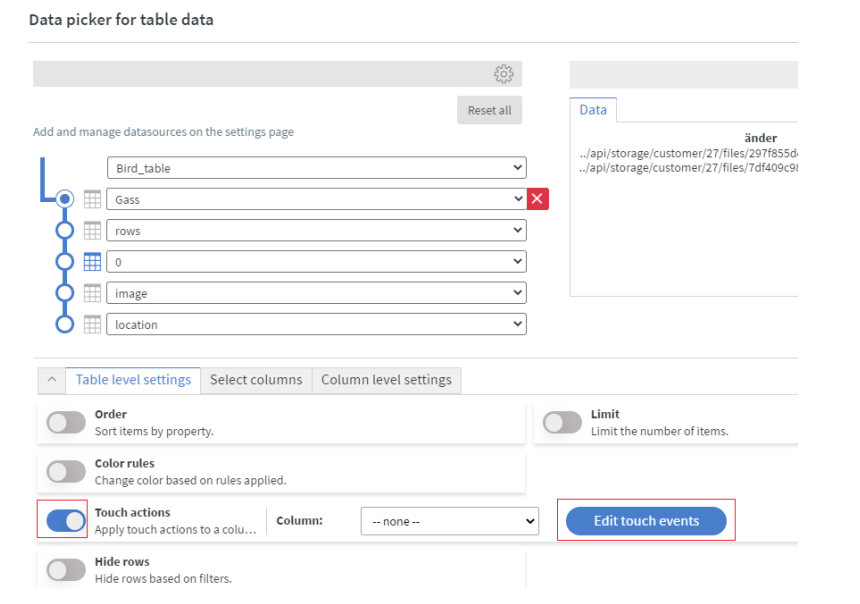
For the Data we need to bind the right table from our Datasource table, with the image location. You can start with the Data setup or with the Touch actions.
If you start with the Touch actions you will be unable to save the table widget itself until you finish the data setup.
Data setup
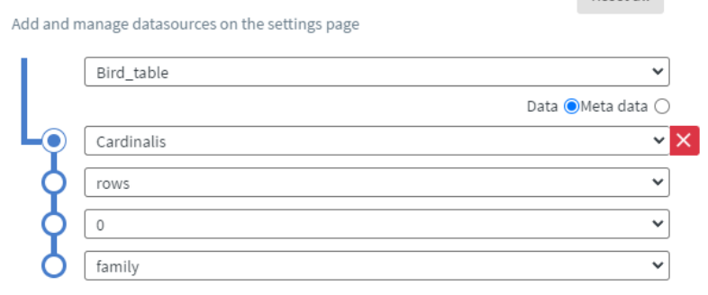
We need to add the Pivot Point (first row of the datasource bind set), to the named bird table (Gass on the picture).
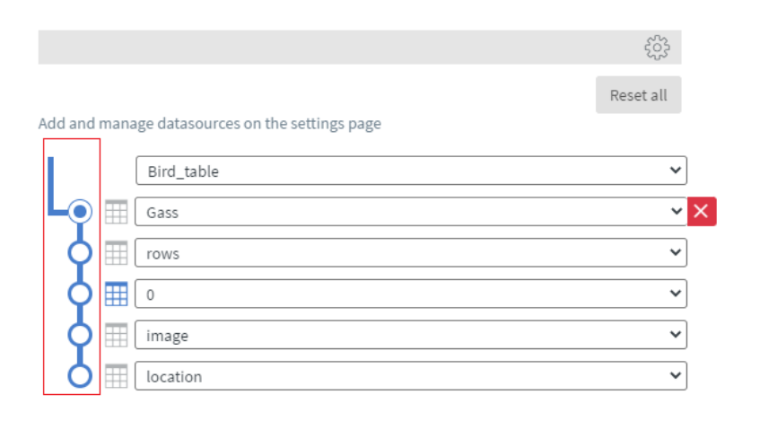
After we set up the pivot we need to add the Selector point to the rows number. With this the table will be able to get all of the pictures of the birds from the bird table, and only the pictures
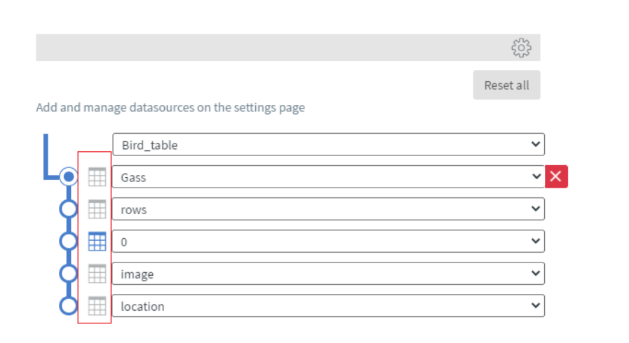
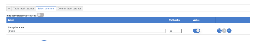
Select columns
Switch to the select columns tab in the data picker modal
You need to search and switch on the Visibility first on the Image and after that the /image/location will appear. Switch on the visibility of that value too.
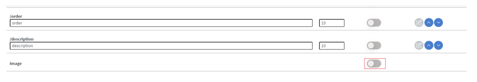
Here you can change the label /image/location and add a name for this table e.g. Ducks.
This will be the column name that is displayed on the top. This is a static value, and not a dynamically bound data, so instead of Ducks you can write anything you like.
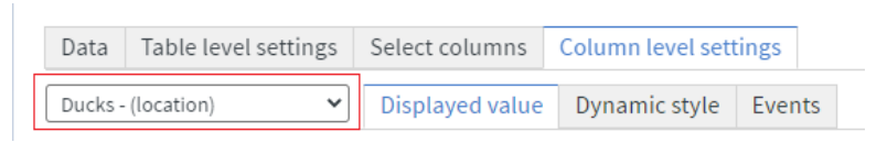
Click on the edit icon and it switch to the Column level settings.
Column level settings
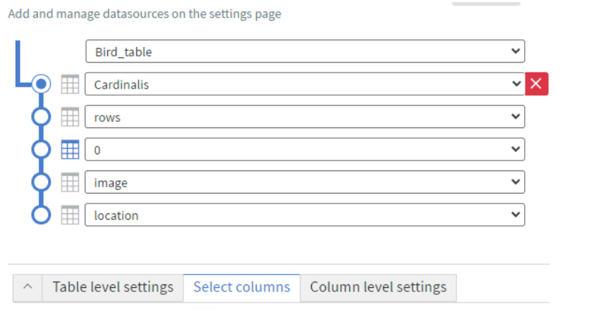
Select the location it will be image/location or if you renamed the column then it will get the renamed name (Ducks).
In the Displayed value change the Type from text to ‘image’
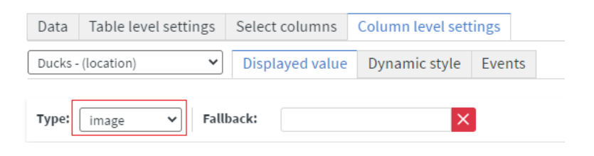
Now we need to click on the save and all of our settings on the Table is now saved.
Table level settings
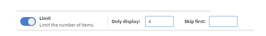
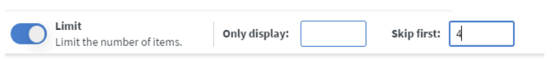
If you need one table to have more columns you need to switch on the Limit option. With the limit
you can display a number of bird or skip birds.
You can do this in the ‘Table level settings’ tab.
An example for this:
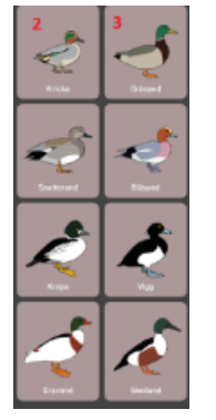
the 2.nd and 3.rd table.
The 2. table you need to add the Limit on the ‘Only display’ to 4.
For the 3.rd table you need to setup the Limit to ‘Skip first’ to 4.
Touch actions
We need to switch to ‘Table level settings’ and switch on the Touch actions and click on the Edit touch events
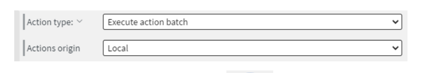
In the Action type select the ‘Execute action batch’ and Action origin ‘Local’.
In the Sent Fields you need to add with **+**the button a Property of received value
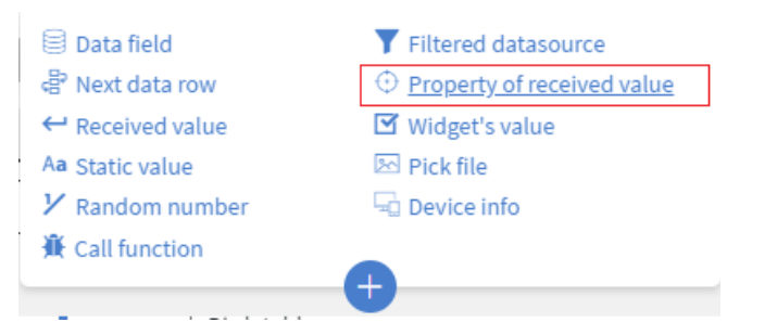
After you select in the new field you need to add the value that is the originalData. The name can be the same. If you click out of the box it will automatically name the value the same as the value itself.
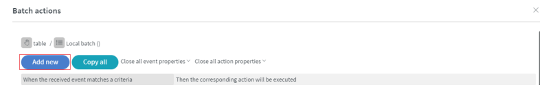
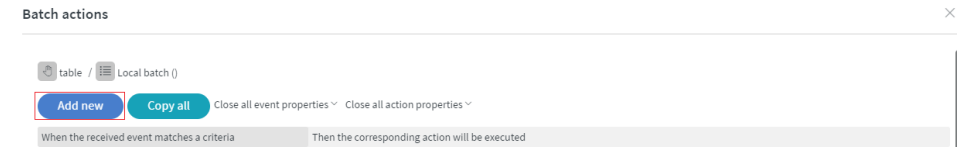
Now we need to click on the Actions >> Actions button

Click on the add new button
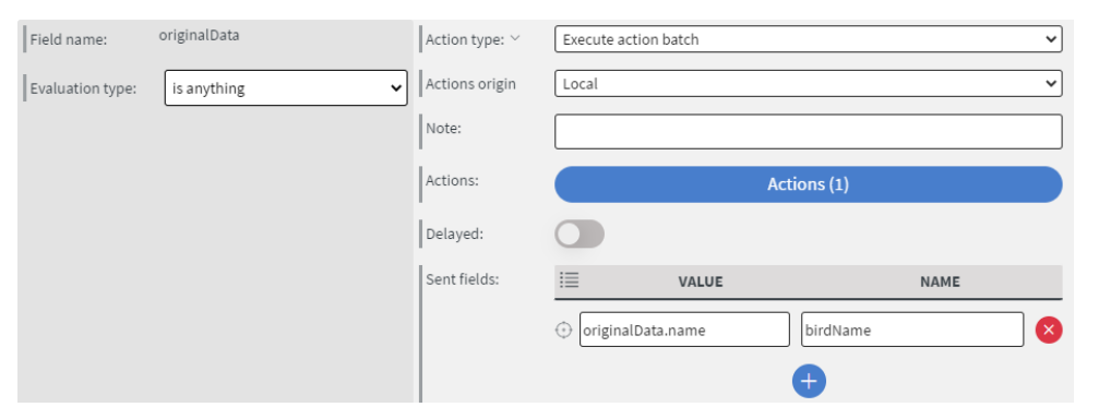
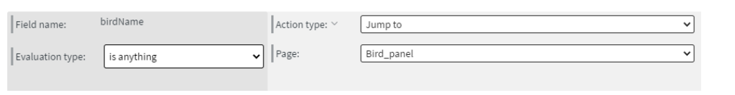
We need to select the Evaluation type to ‘is anything’. Select the Action type to ‘Execute action batch’, and Action origin Local (as before).
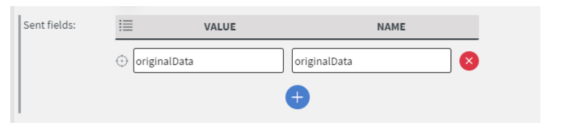
For the ‘Sent fields’ add a ‘Property of received value’ (same as previously). In the Send field now, we
write originalData.name and the name is ‘birdName’.
With these settings, we can change the data name for bird name, which we will get from originalData.name, where the .name means the name column of the Bird_table we created in our
datasource.
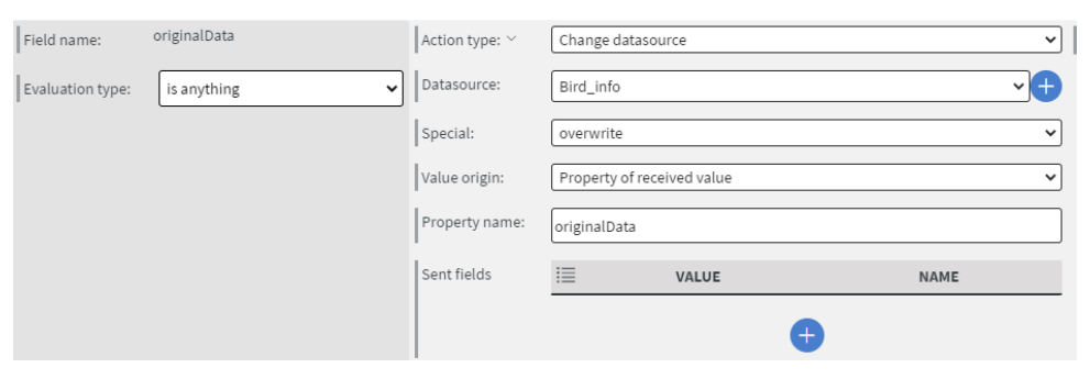
In the up-left side click on the add New button.
We need to select the Evaluation type to ‘is anything’. Select the action type ‘Change datasource’, and in the Datasource field select the Bird_info (this is our mock datasource’s name we createdpreviously). Change the special to ‘overwrite’, Value origin to ‘Property of received value’ and Property name to ‘originalData’
After we set up these two actions, click on the first one’s , Actions > Actions button and inside we add a new row.
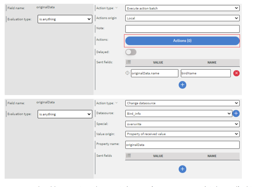
Here we only add one action. The type is ‘Jump to’ to a page to our ‘Bird_panel’. This will navigate us to our page where we display our bird
Now we need to click 3 times on the Save icon, until we came back to the original Data picker for table data. This is saving all of the setups now in our Touch action.
If you start with the Touch actions you will be unable to save the table widget itself until you finish the data setup.
Finally save the table widget with the save button.
Design
We have a similar table widget now filled with our bird pictures.
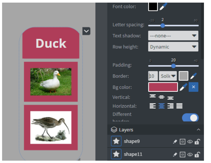
Click on the table widget and in the Widget > Other > Cell style switch on the Different header
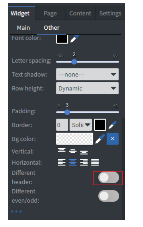
After this option Is turned on, we can add a different style to the header in the Header cell style.
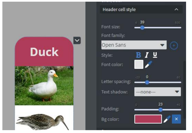
Now that we set up the header, we can format the cells themselves.
In the cell style we can set up a padding. With this our birds will be a little bit separated.
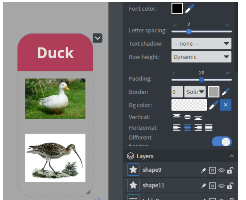
n cell style select the pipette icon next to background color and click the header cell colour
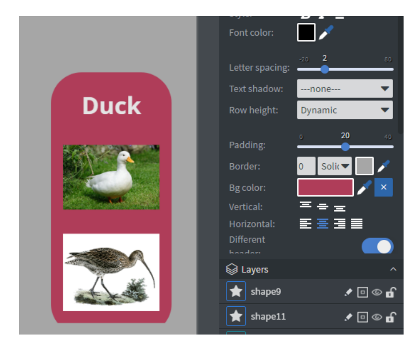
For the Border select with the pipette the background colour and give a 10 px border
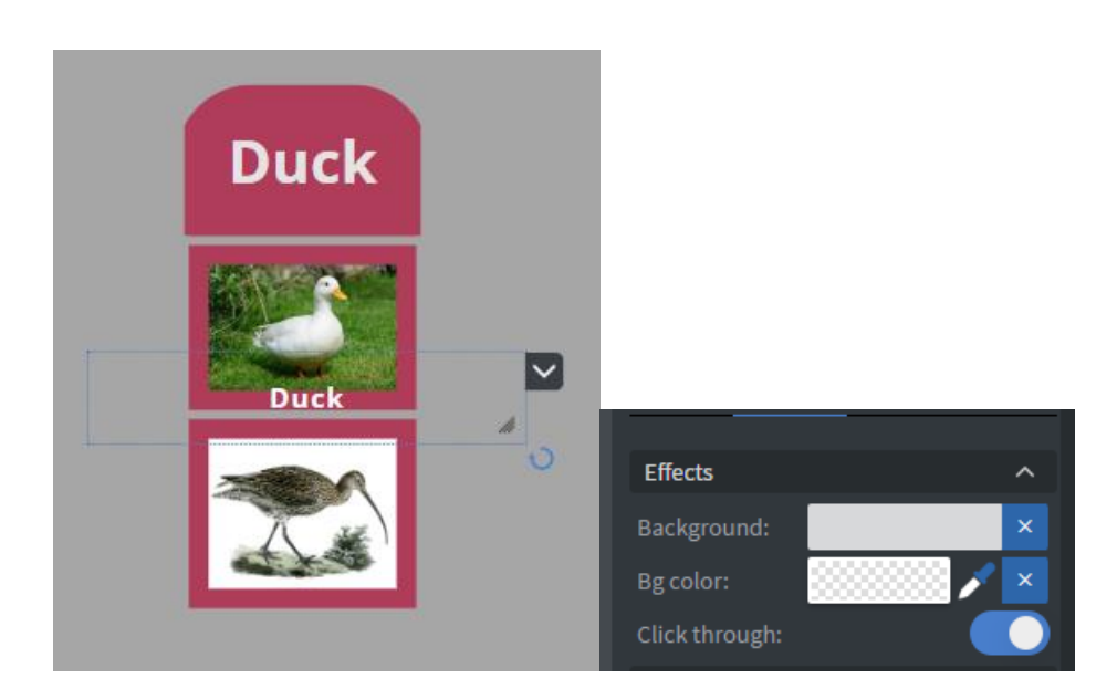
Because the table is set up so that it can only display images, we need to add text widgets to the page for the Birds name.
After you bind the bird's name from the Datasource table, or write manually to the text box in the Widget > Other > Effects, you need to switch on the ‘Click through’ function. With this, you can resize
your textbox widget to cover the bird’s picture, and with ‘Click through’ you can click on the element.
If you wish to create a table widget without a header you can always set both the heather text and background color to the page’s background color. That way all the spacings will stay the same and the header becomes ‘invisible’
Also, you can replace the now invisible header with a formatted and databound textbox. That way even the header is dynamically generated.
The result is a bit different than the initial design, but it can be modified with Shape widget andexperimentation.
Now we are finished with the first page of our Content!
You can save your Content. Click on the save icon on the middle menu to save our progress
Bird_panel
Databinding your Texts, Images widget
If you set the base datapath for your content, please disable the Depend on base data path setting on the widgets of this page since we will use the Mock datasource for these.
You need to databind all of the widgets to your Bird_info (Mock Datasource), expect the play sound function, video function, and close function (back to default page/ bird selector).
For those there is a different binding needed, that you will see further in the presentation.
The general layout of the bird panel based on the concept is this:
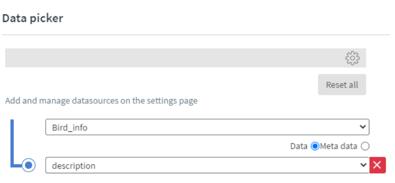
The example here is to bind the description of the bird to our mock datasource
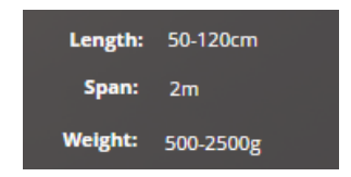
Giving unit/measurement to the databound text
Sometimes we need to give a measurement to numeric values e.g. Wing span.
When you bind them, you need to switch on the Special formatting option, and ‘after the bound value’ option you write the desirable unit.
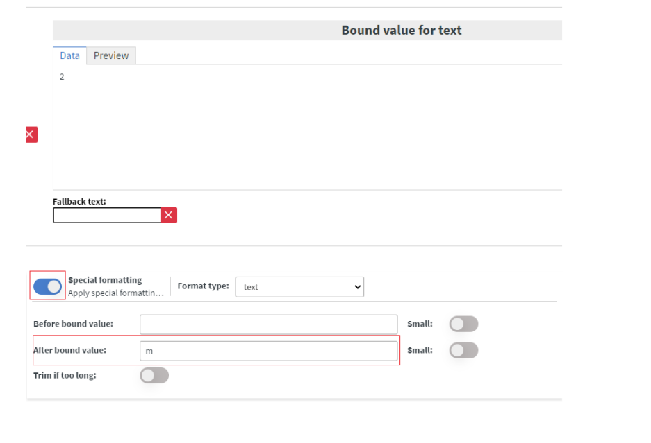
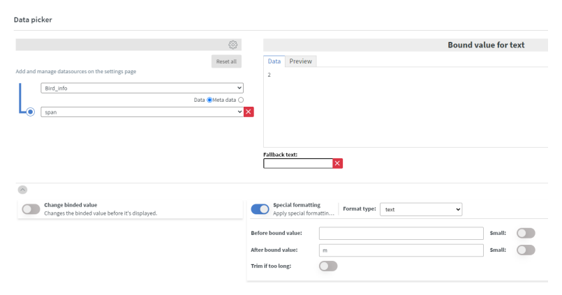
You cannot create a space between the after-bound value right now.
This is how your bound values will look like:
Set up your video, play sound and close button
Video
For your video functionality you can use a simple Image widget, and browse the uploaded play button icon.
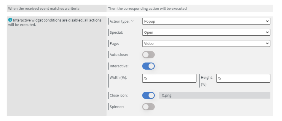
Ater that you need to navigate to the Widget > Other > Interaction > Click type and choose Actions from the drop-down.
Now we need to edit a touch event for it, click on the ‘Edit touch events’ button. Here the familiar event editor will pop up.
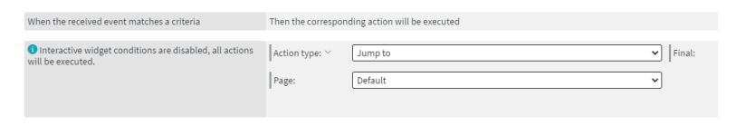
We then add a new event and give the Action type: ‘Popup’, Special: ‘Open’, Page: ‘Video’, and switch on the Interactive button.
In this presentation, we give a 75 % width and height to it. This is because we want to see the video, as well as other details on the page.
Finally switch on the close icon and give it the close button.png.
Here is what the filled-out details look like:
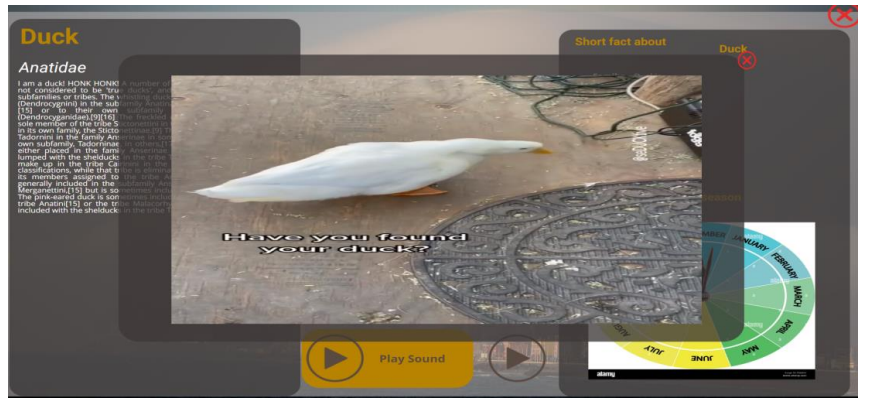
A preview of the general look of the Video page when the video is playing:
Play sound
In this presentation we use 3 widgets, an image with the play .png, a text widget and a shape
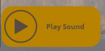
For the Picture and Text in the Widget > Other > Effect we switch on the click through. This is needed because we want the shape widget to be clickable, and if we choose the other two, there will be an issue that sometimes the sound will not play if no one click on exactly the widgets. This way the two other widgets will be also clickable.
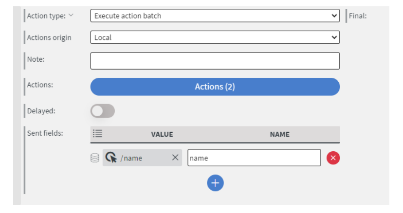
Now for the Shape widget we go to the Other > Interaction >Click type to Actions. Now we click on the Edit touch Event. Here click on the to add new button. The Action type ‘Execute action batch’. Action origin: ‘Local’, and in the Sent field select the ‘Data field’. For the Value we are we binding our Bird_info (Mock Datasource) name. The name of the value can be the default ‘name’.
After this setup we need to click on the Actions button.
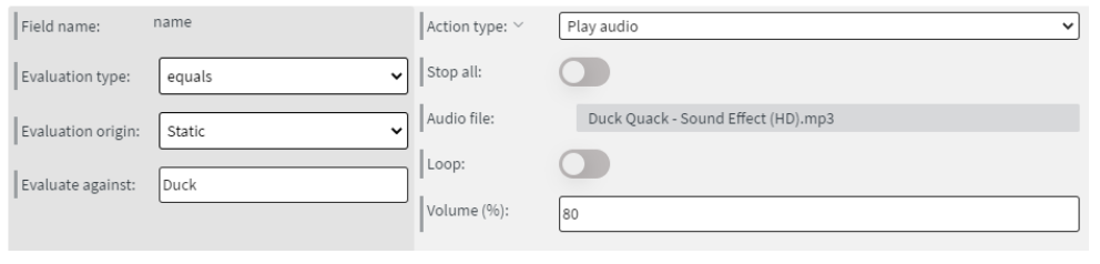
Click on the add new button. Here we need to change the Evaluation type to ‘equals’, Evaluation
origin to ‘Static’. The Evaluate against will be our bird's name, e.g. Duck.
The Action type is Play audio, and the audio file is the sound of our bird, what we uploaded or synced
in our folder named ‘Bird’.
In our presentation we choose 80% sound level.
You don’t necessarily need the name field itself specifically for this process. You can use any other field, the idea is that this field needs to be unique for every single bird, so the action can evaluate against it. Also, if you decide to use name as the evaluation field, please make sure that the spelling in the datasource, ‘name’ field is the same, as here in the action’s ‘Evaluate against’ value.
Because of this binding technique, we need to add a separate action for all the birds, to the play
sound. Without that step, it will not play sound for the bird.
There is a ‘Duplicate action’ button in the right side of every action row, to make the process a bit
easier
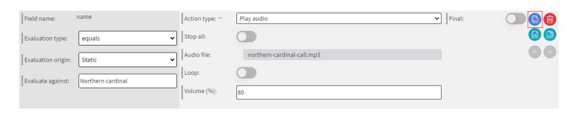
When we finished to add all of our actions for sounds to the action list, we need to save it
The sound will play in full length, even after navigating from the page, and there is no way to cancel it. For this reason, it is best to have a few second soundbites as the birds’ sound.
Close button
Because we came here to this page with a jump action, we need to navigate back to the main
Content.
In this presentation we use an Image that we uploaded as our close icon.
In the Widget > Other > Interaction > Click type we change it to Actions. Click on the Edit Touch
events. Here we add a new action, where the Action type will be ‘Jump to’ to the Default page. Click
on the save.
Design
Now our Bird_panel is finished and set up. Save your Content as well. In this presentation our Bird_panel looks like this:
Video
Video widget
We need to put down and setup our Video Widget. Navigate to the Widget > Other > Data > Bind to data to bind our widget.
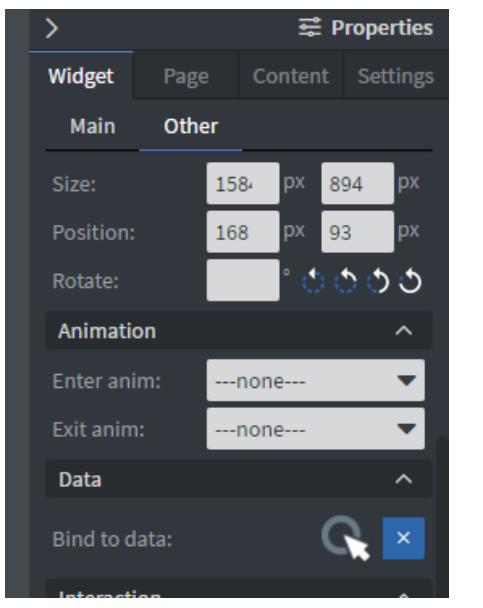
In the Databind we need to choose the Bird_Info (Mock Datasource) Video/location.
Design
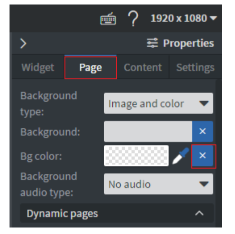
In this presentation we made the Page background of the Video page transparent. You can change to transparent in the Page > BG color > with the X icon.
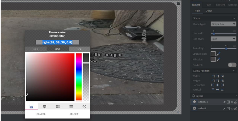
We put down a shape widget behind the video widget with rounding, and not fully opaque color.
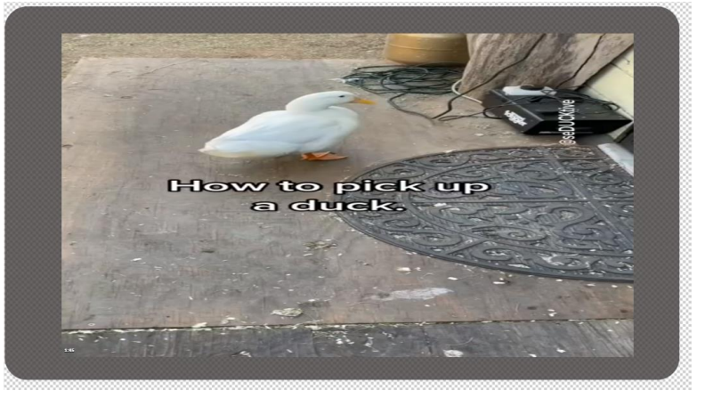
Click on the select and click on the save button. Now our Video page is completed. This is how it looks like:
Screensaver (Optional)
Design
In the presentation we use a Gallery (Image) widget, where we put 3 selected images, and make the
Page Background transparent.
You can create this page anyway you like, for example instead of the only three images you can give
the Gallery widget a Folder connection, or instead of Gallery you can place a Video/Videos or
Content/Contents widget.
You can experiment with whatever you like!
Setup to became a screensaver
We need to set up now our Screensaver page.
You can set up screensaver in the right-side menu Content > Dynamic pages > Screen saver.
Here you need to select the ‘Screensaver’ page. The Return page is needed to be ‘Default’ what will
navigate back to the first page.
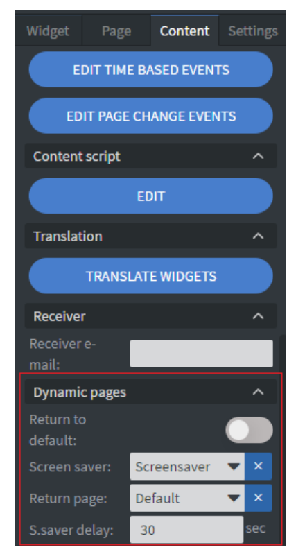
S.saver delay is the timer, that will change the pages to this Screensaver after the time’s up (sec) and there were no interactions on the page. E.g. If you use 2,5 minutes videos and you give plus 1 minute for the user to close the video, your S.saver delay needs to be 210 sec (3,5 minutes).
After the screensaver is set up save your Content.
Epilogue
Now the Content is finished and ready to assign to a screen!
If you have any question about it, please contact us in the [email protected]. Happy Content creation for all of you!